
Apothecary Group
A complete brand refresh for a network of full-service concierge pharmacies across Manhattan, Long Island, and Beverly Hills. With nine locations and a mission to bring sophisticated, personalized care back to the pharmaceutical experience, the new identity was designed to elevate the brand while preserving its sense of trust, expertise, and personal service.
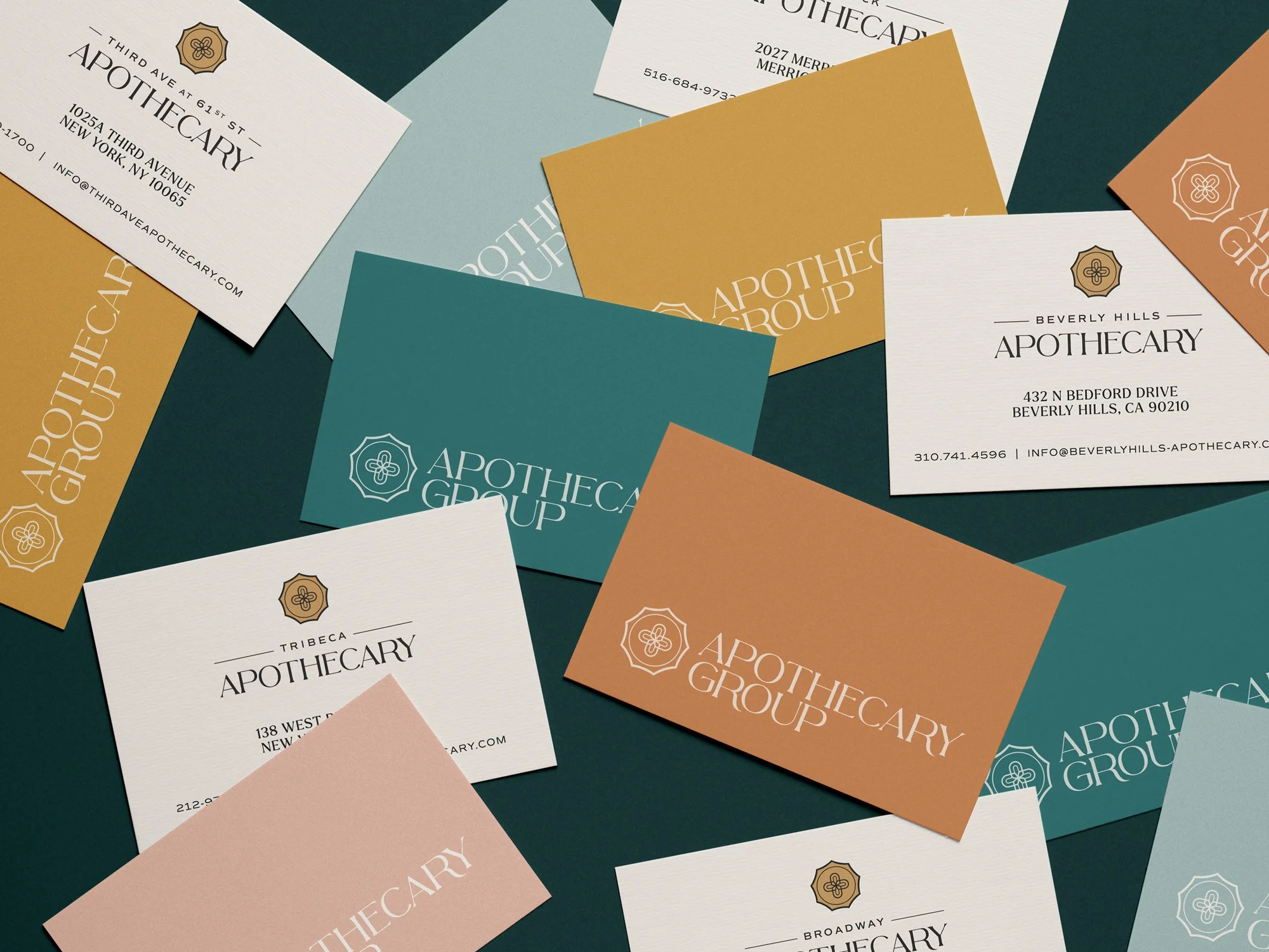
The visual language began with a stylized exploration of traditional apothecaries, reinterpreted through a refined, contemporary lens. A custom word mark followed, pairing elegant serif references with exaggerated curves and sweeping extensions to create a mark that feels both luxurious and distinctly modern. The accompanying medical cross icon draws from the visual language of vintage wax seals and apothecary stamps. Its curved forms and contrasting line weights echo the wordmark, creating a cohesive identity system that balances heritage with modern sophistication.


Nine sub-logos extend the identity across each individual location, creating a consistent typographic hierarchy that allows each mark to feel unique while remaining unmistakably part of the larger brand. A rich palette of deep blue-greens, golds and coppers adds further distinction, bringing a sense of flexibility and locality to the system.

An 80-page brand guide details how to consistently express all elements of the newly re-imagined brand from type styling and logo usage, down to print applications and collateral design.

